

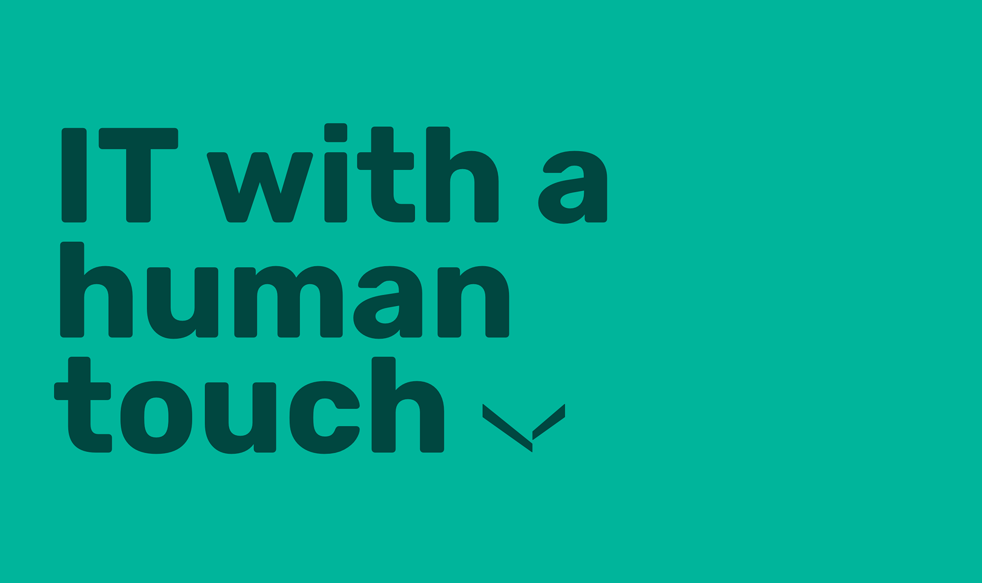
- the company that sees you
Sawubona means "I see you" in Zulu. It's an invitation to meet as humans and to communicate with each other in search of something you can't find by yourself. And yes, they're also an IT consultant company that manifests exactly that, the fact that people are our greatest asset.
Visual identity and web design / Sawubona IT / Fall 2018
- challenge
As Techno Group Consulting became Sawubona, they took the opportunity to change not only their name, but pretty much everything else as well. Going from being a traditional player within IT consulting to a South African influenced company that put tech aside to prioritize the people. And in the middle of it all, there was this website and visual identity that had to make sense. Hence the challenge.
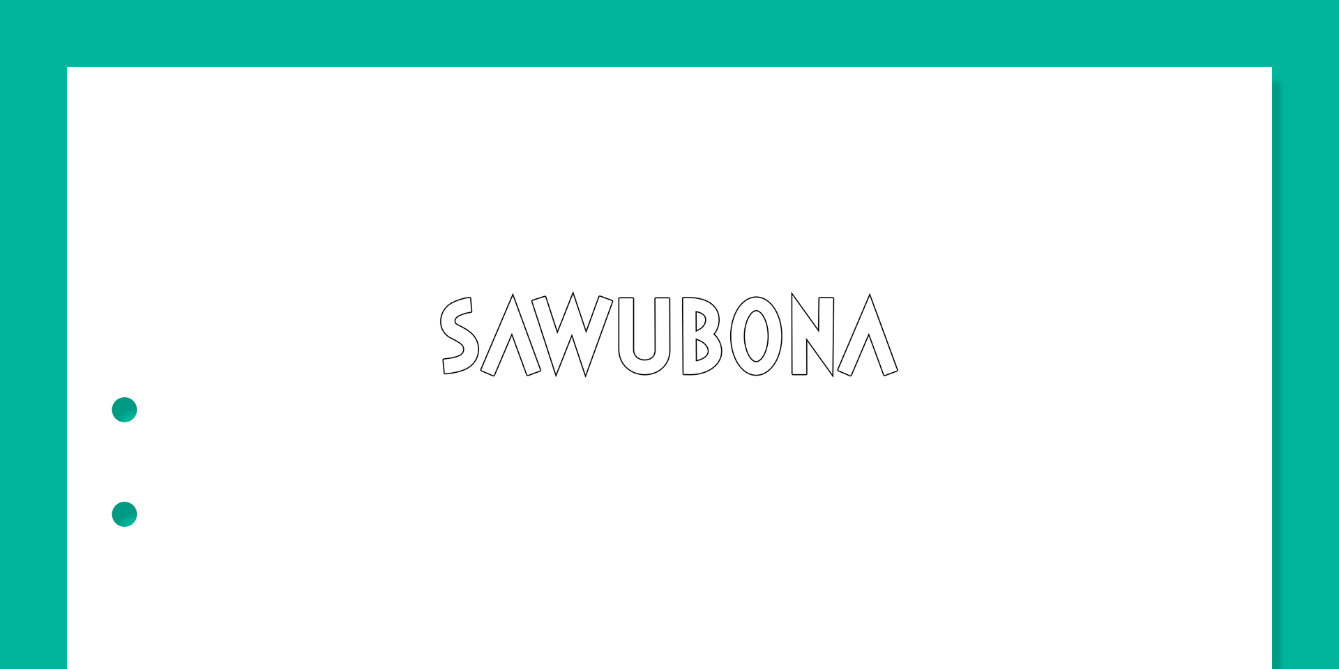
The custom made wordmark.
- solution
By staying away from deep blue colors and that bubbly node-inspired logotype that seems to be every tech company's first item on their list of branding essential, Sawubona's visual identity is meant to stand out in an otherwise homogeneous crowd.
The visual foundation is a warm and intense palette and an irregular striped pattern that emphasizes the humane and personal touch that Sawubona are looking to mediate. Upon which the rest of the company's look and feel, as well as the website, are built.

The Sawubona stripes. Influenced by the pattern you can find on South African fabrics.

The company symbol. Extracted from the Sawubona stripes.
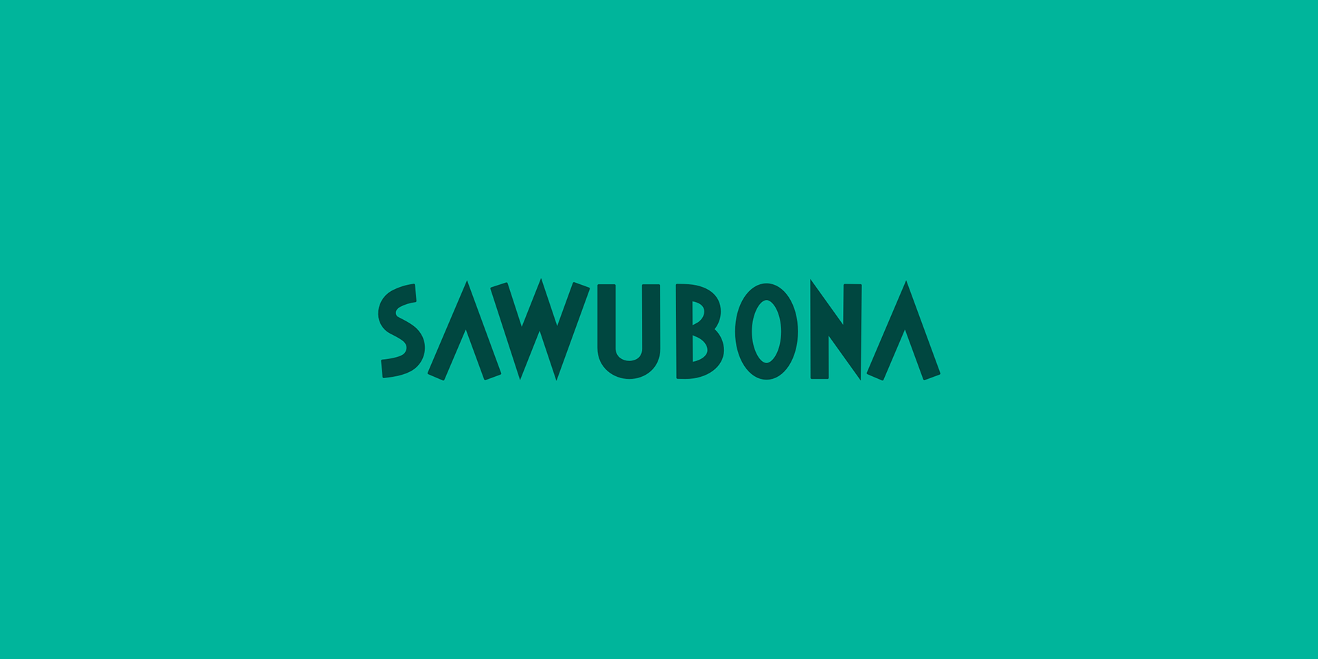
The unique wordmark.
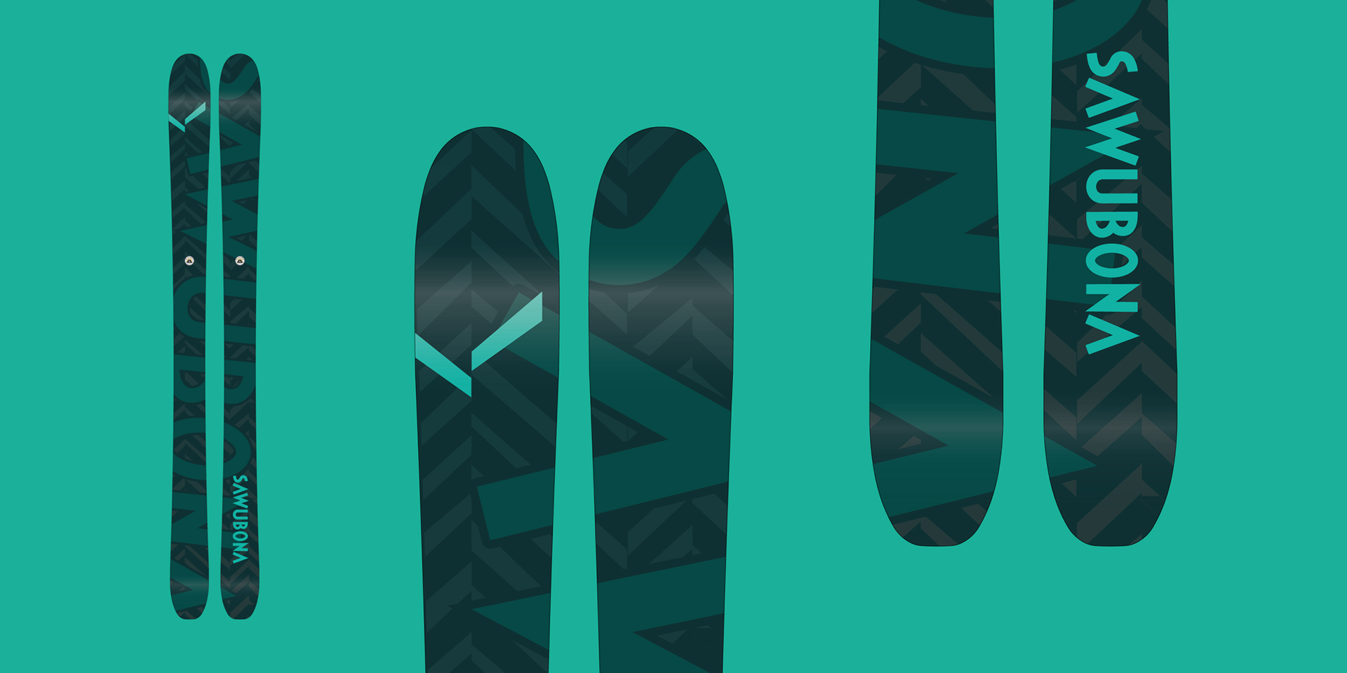
Sawubona branded alpine skis. Built by Åre Skidfabrik