

- making the most out of your strengths
Innoveramera is a newly started tech consultant company that experts in Android development. By focusing on one platform they make sure they always have the competence to produce high end deliverables.
Visual identity / Innoveramera / Spring 2020

- challenge
To design a visual identity that felt contemporary and suited for the context, while still being exciting and noticeable among other companies within the same field of business.
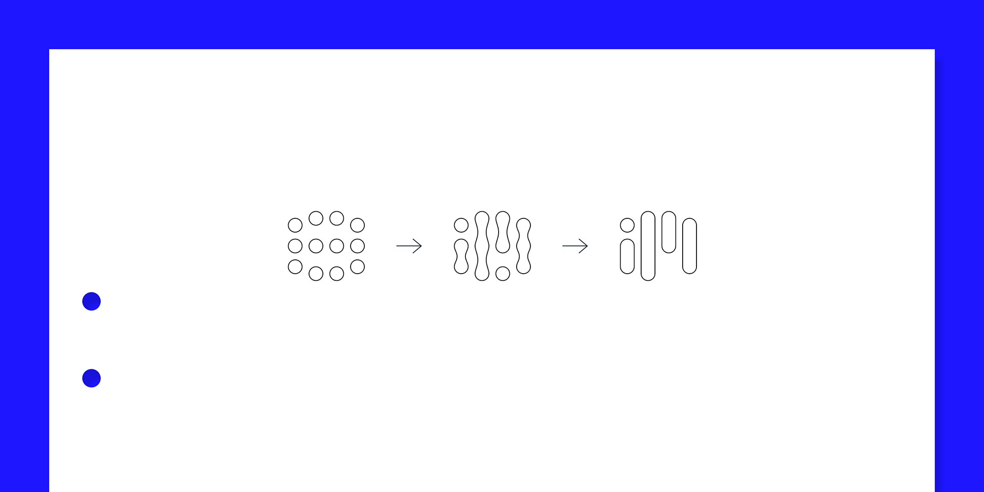
The symbol origins from a symmetrical shape and holds the letters i and m.
- solution
The result is a visual identity that feels close to home, at the same time as it highlights the company's confidence in always producing at the highest level.
Their expertise in Android development is reflected in both the logo and the choice of Roboto as the main font, while the dark and distinctive color palette empathizes the focus and competence put into their deliverables.

The logo consists out of a symbol and a wordmark.

The Innoveramera symbol
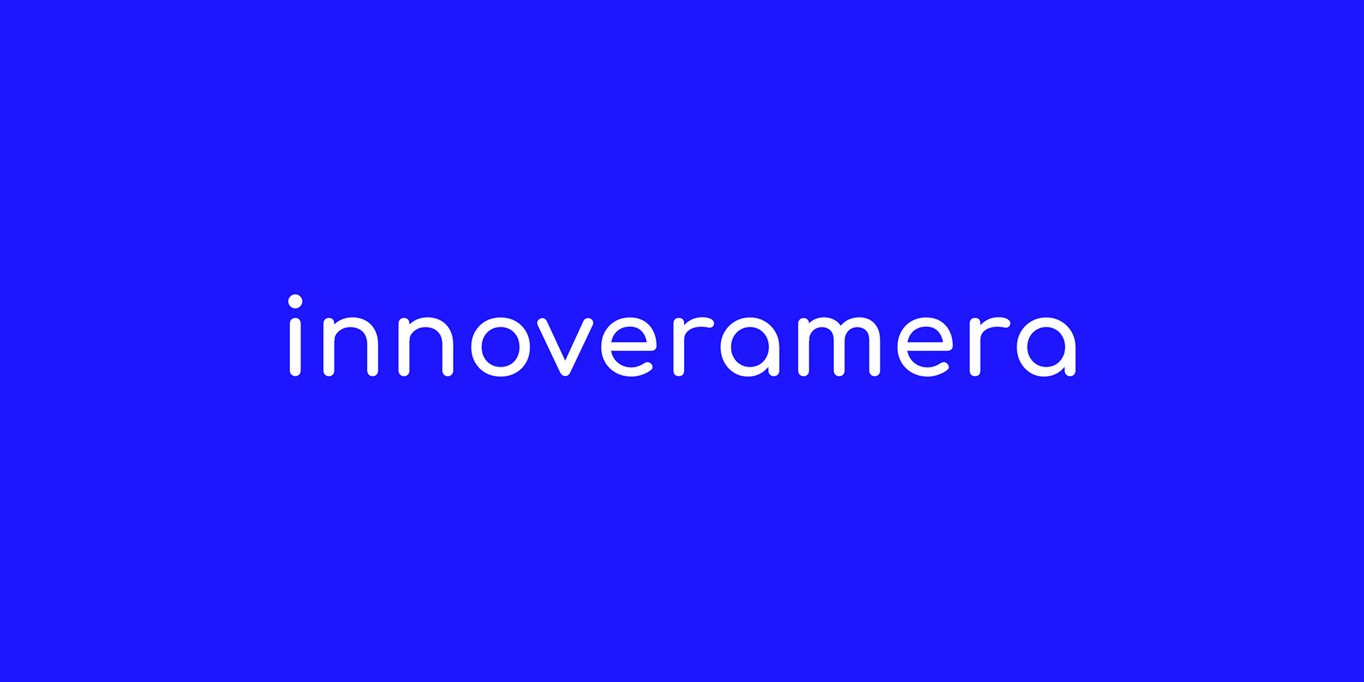
The Innoveramera wordmark